Autumn Vista Campaign
Action
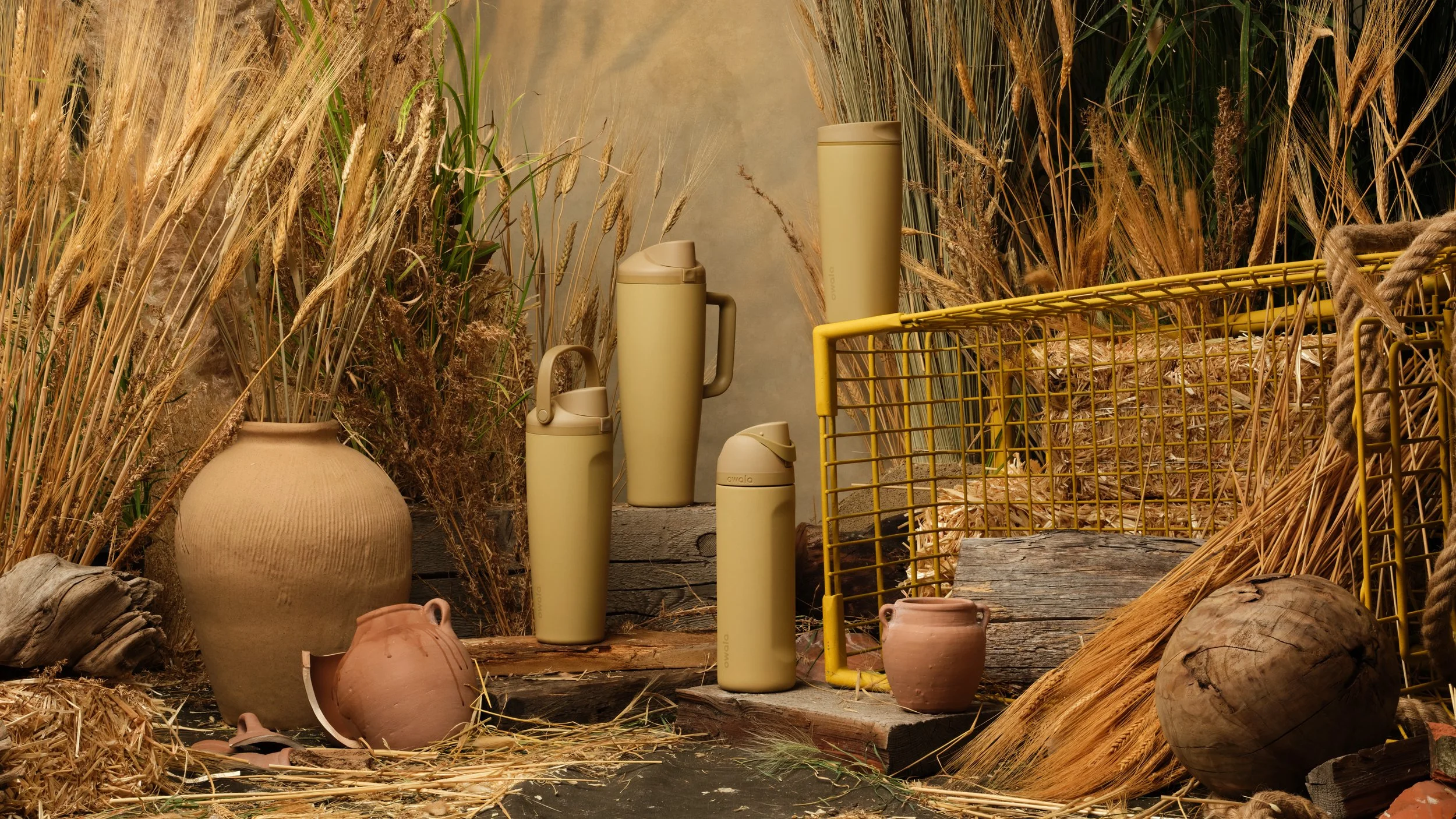
I developed the creative concept around a
harvest-ready wheat field, leaning into warm,
textural fall tones that complemented the mustard
bottle without overpowering it. I incorporated the shopping cart motif to align with the broader Color
of the Season campaign system.
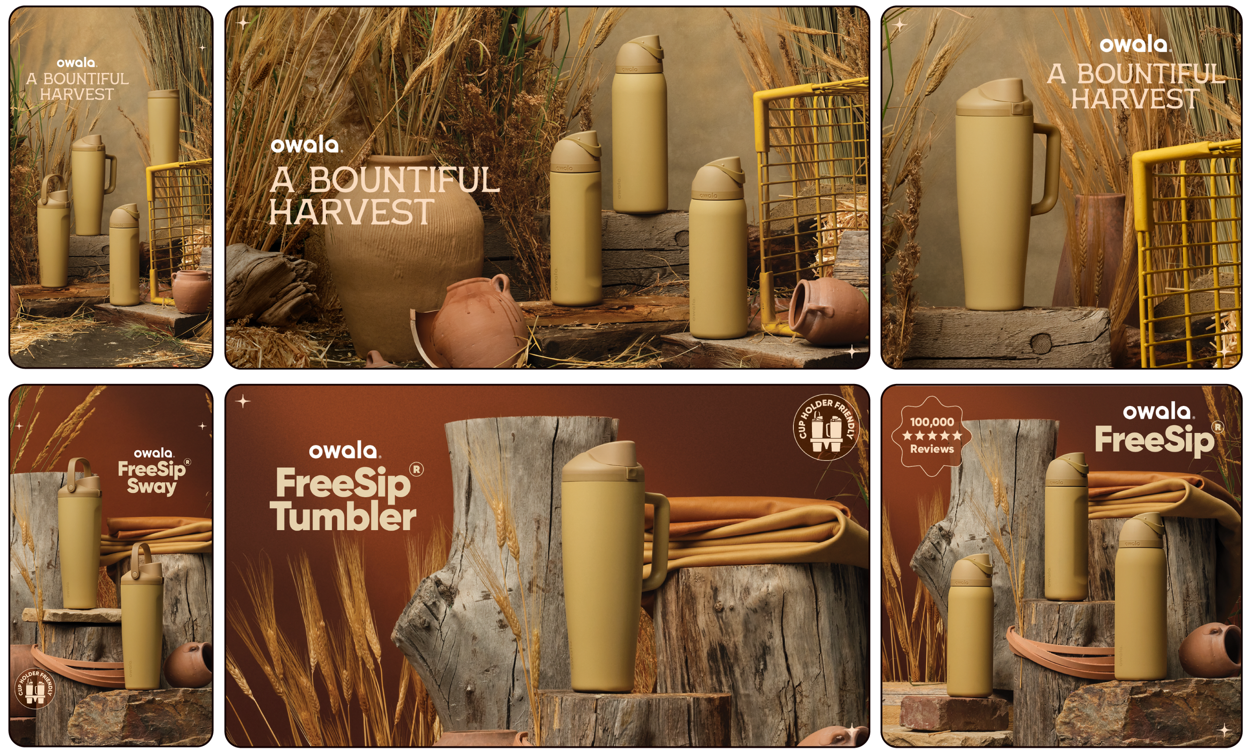
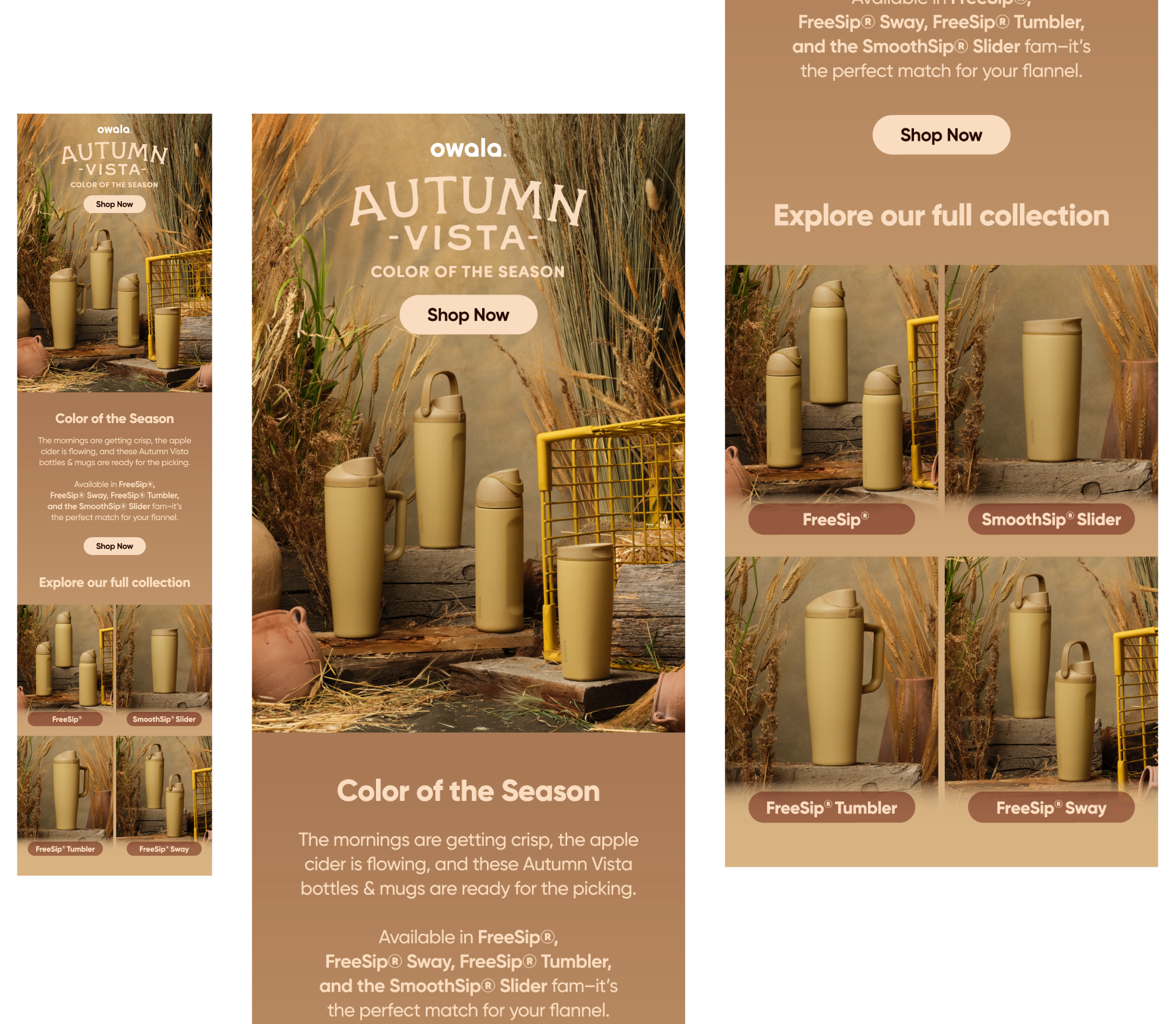
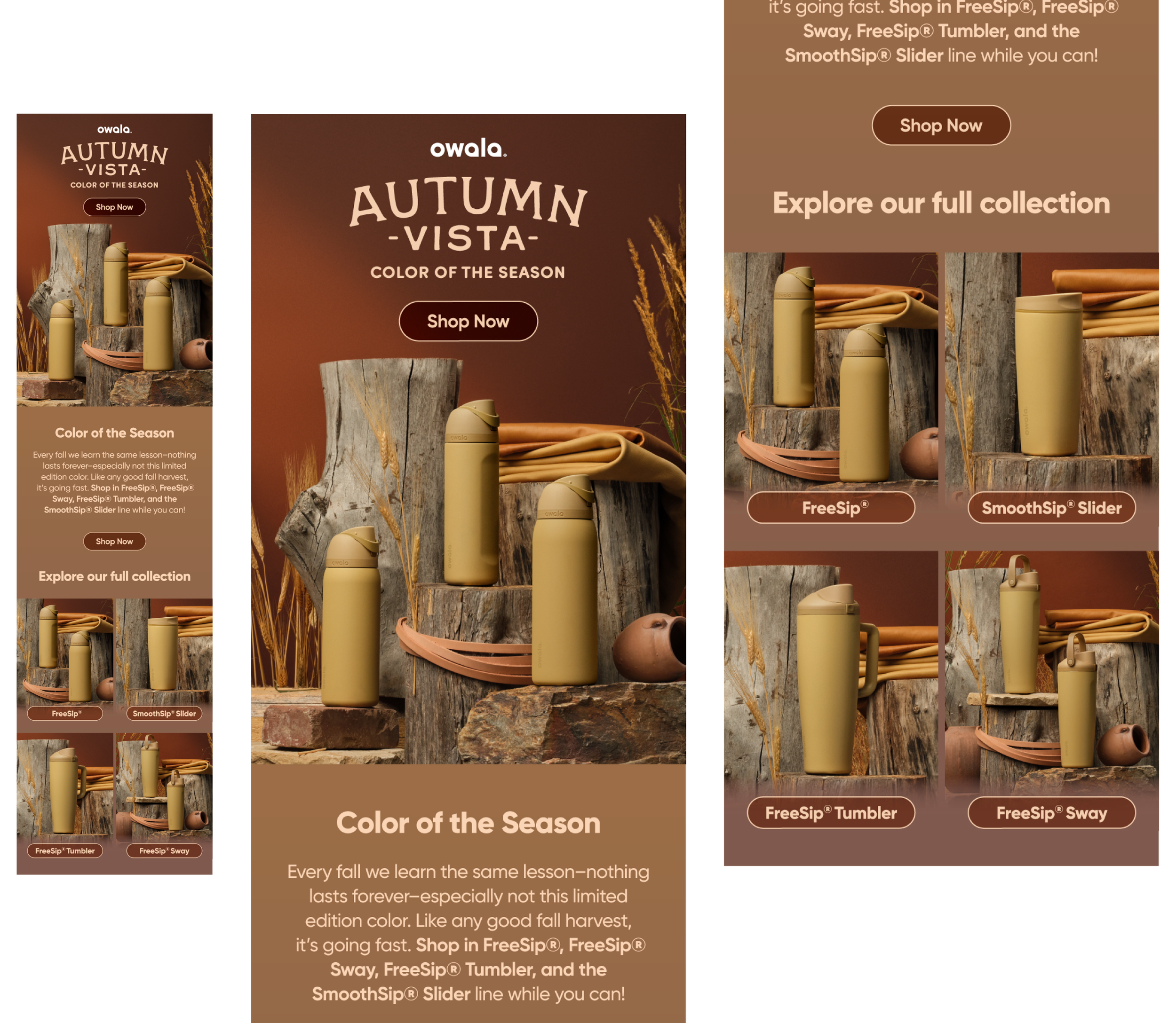
I created the production deck, defined the color story, and art directed the shoot to ensure lighting and environment enhanced the bottle’s richness. To support performance variations, I developed a secondary, higher-contrast set that provided visual flexibility. Post-shoot, I executed the full campaign rollout across social, paid ads, banners, and email, maintaining consistency across all touchpoints.
Problem
For our Color of the Season – Autumn Vista special edition bottle, we needed to visually define fall within the larger seasonal campaign. The mustard colorway had to feel rich and desirable while clearly tying into the overarching “shopping cart” concept used across the Spring and Summer launches. The creative also needed to feel cohesive with previous seasonal shoots while introducing a fresh fall perspective. Additionally, we needed both a primary look and a contrasting B-version for testing and placement flexibility.
Result
The Autumn Vista launch delivered a visually cohesive fall moment within the larger seasonal campaign while allowing for performance-driven creative testing. The warm harvest environment elevated the mustard colorway, making it feel premium and seasonal without distraction. The final assets seamlessly extended the Color of the Season system, strengthening campaign continuity across all three seasonal launches
credits
Art Director - Inese Silina
Concept | Designer | Art Director (set) - Rebecca Larson
Photographer - Blake Tolley
Photo Retoucher - Derek Dodds
Videographer - Sam Wood
Set Designer - Drew Welsh & Mao Barroteran
Copy Writer - Kiersten Sellstrom